Clock Poter
Background
Intro To Graphic Design
2023
Process
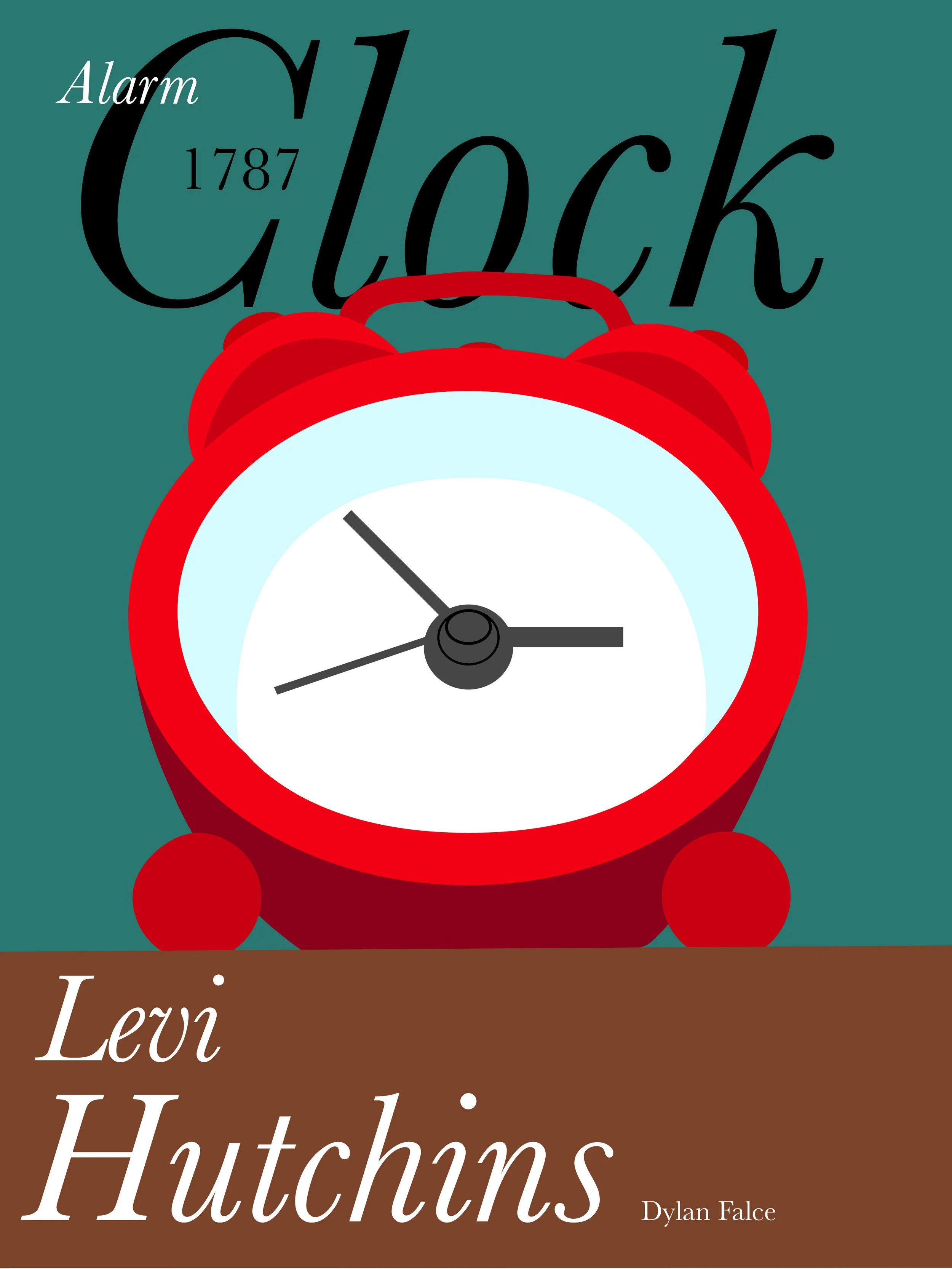
This was one of my first graphic design projects, and it was my second poster. We had to take an item that we owned, illustrate it, and give details on the inventor, year it was made, and name of the item.

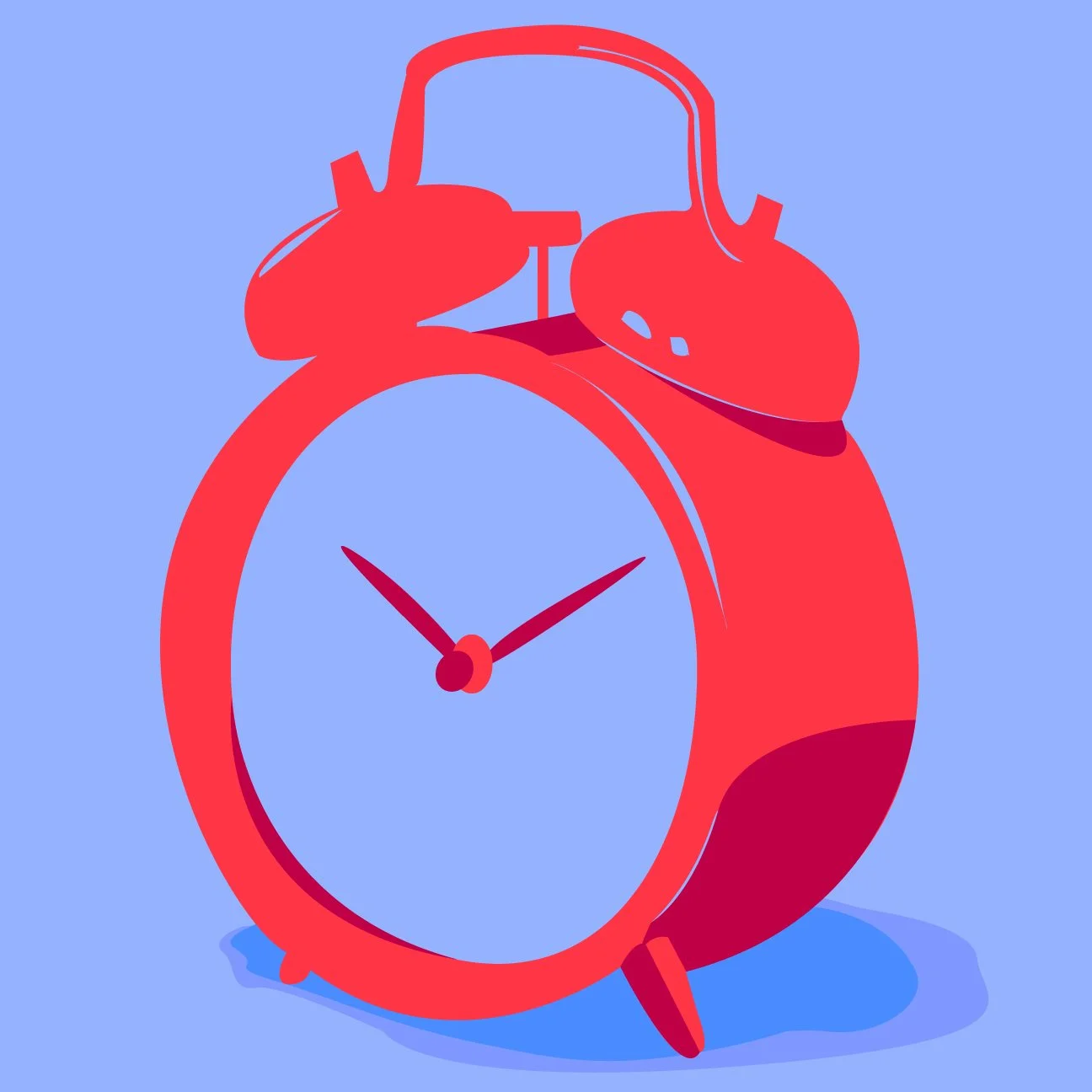
For this Project, I chose to illustrate an alarm clock. I had a mini one in my room, and its bright red color drew me to it. I first started with a different design but was very unhappy with it. In the end, I’m happy with the final posters, and this was one of the first time I got to really mess around with the pen tool in Illustrator as well as layers and colors too.


Old vertions
Before the final critique day, we all came in with our in-process designs. I had a different version of the clock with a much more abstract layout for the text. I didn’t like it very much but didn’t know what to change. Going into class knowing you don’t like your work is such a horrible feeling as a designer. looking at everyone else’s and saying to yourself, “Am I out of my league?” is worse. I remember thinking that and leaving class so defeated. Back at my dorm, I wanted to improve my design. Slouching down in my chair and looking at the tiny clock from a new angle gave me an idea. What if I made the little clock look big? That’s what I ended up doing. I think this change, along with spending more time on text and background colors, gave me my biggest jump in my graphic design career so far. Looking back on this I learned so much about myself and about design in a single day and it still is something I am thankful for to this day.
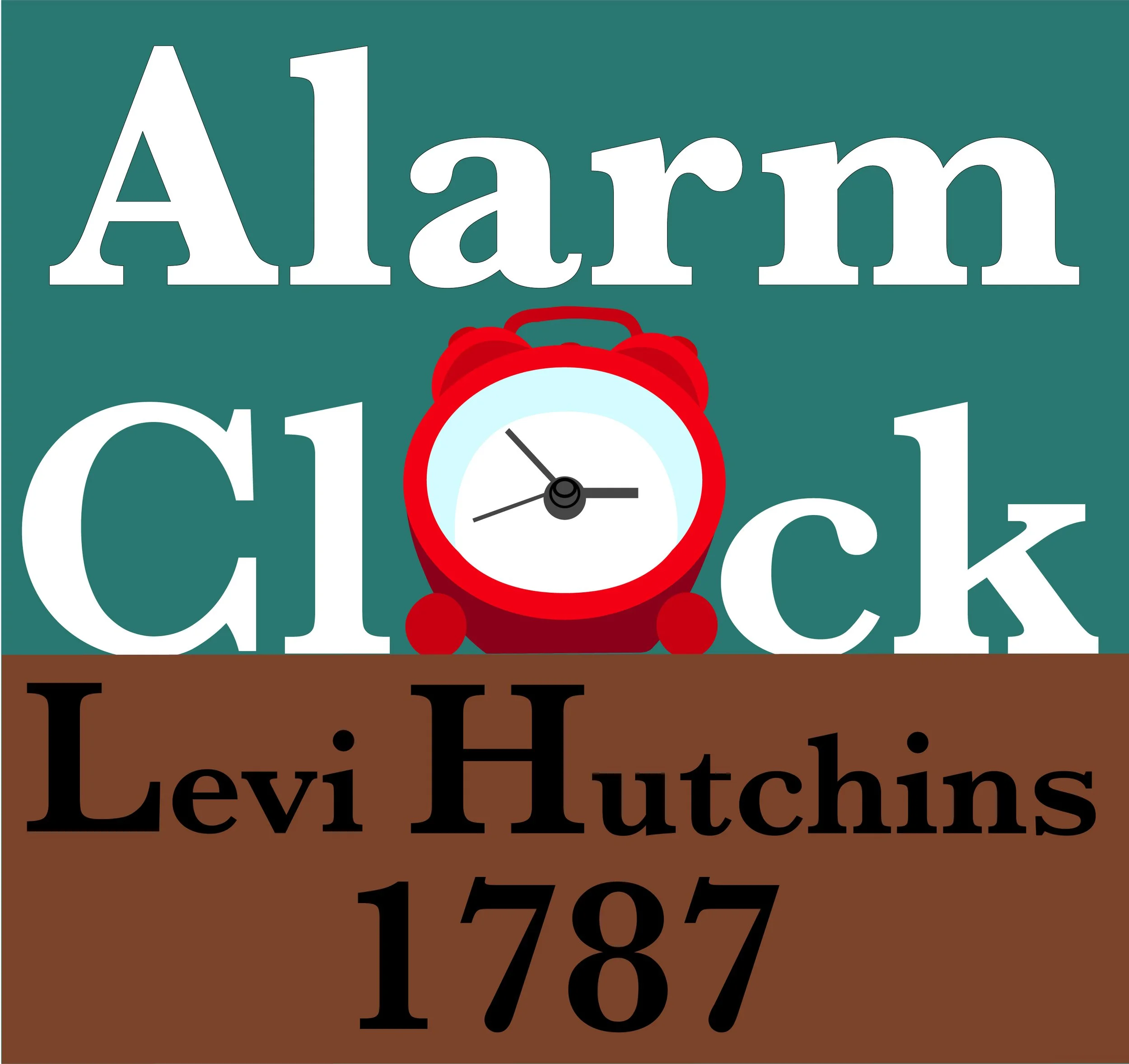
Full Sized
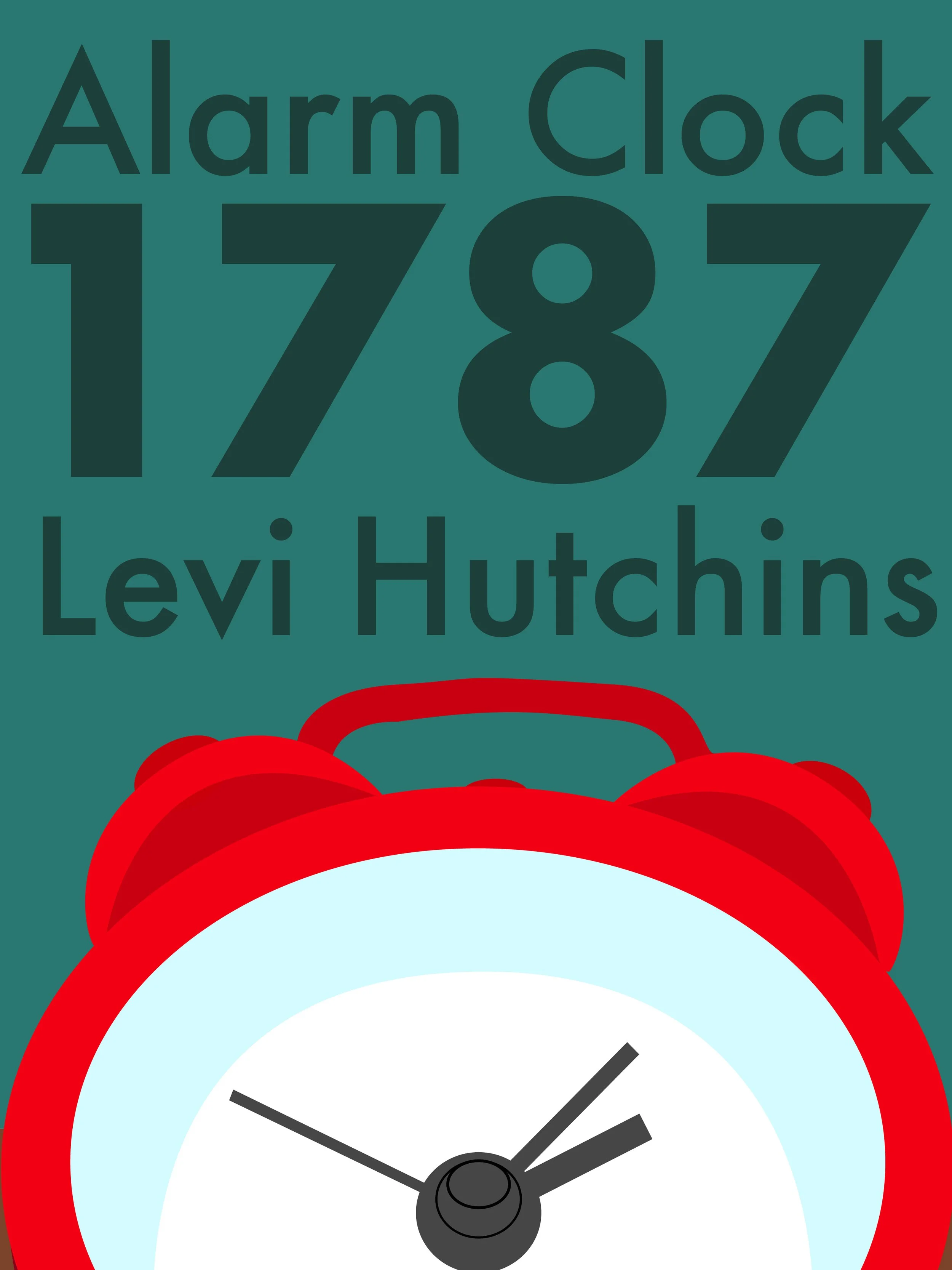
Unfinished/Unused