BackGround
For this Project we had to create a wordmark for a fictional Amazon or Netflix show. I chose a sci-fi show, calling it Ebb of Man
Typography
2023
The Idea
As long as we had the show on Amazon or Netflix, we had complete creative freedom. I wanted to do a psychological thriller in space, this idea eventually became Ebb of Man. I pictured the show to be following a group deep in space as fears for what could be out there start to make them turn on each other. The significance of ebb is the crew moving physically away from what is known, as well as mentally as the issues on board consume them.
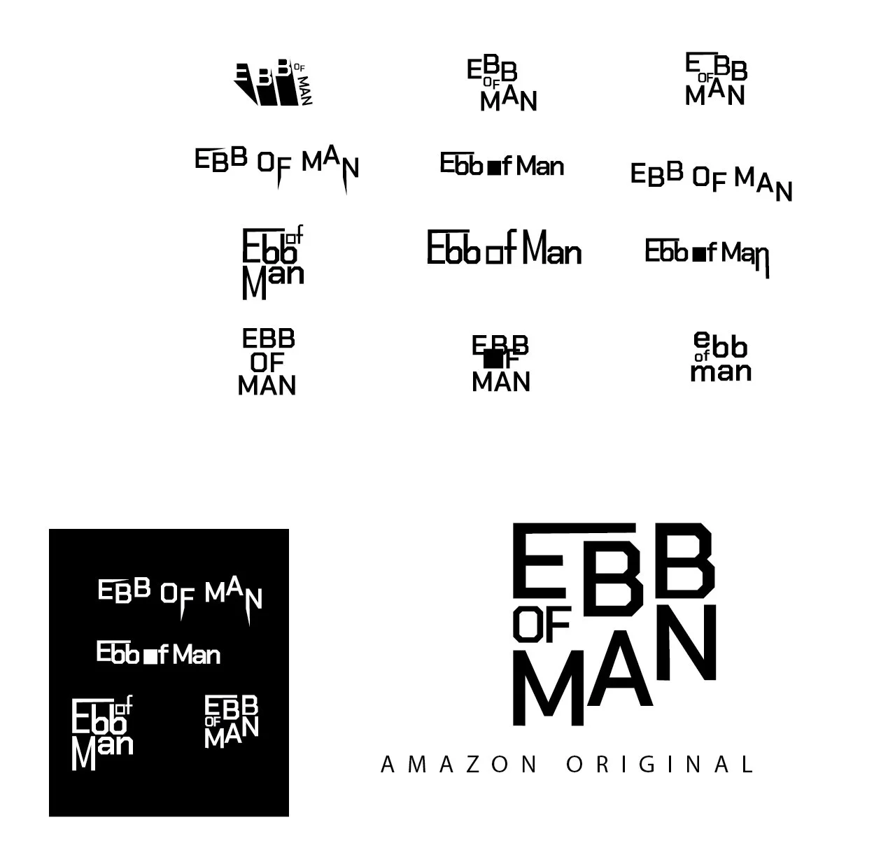
Sketches
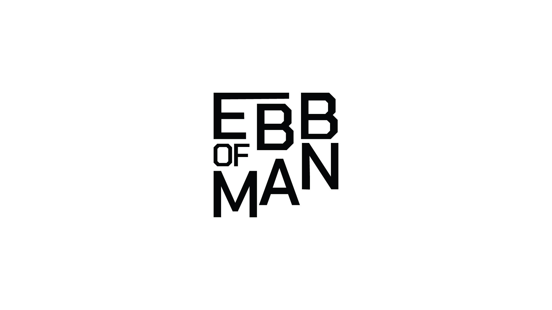
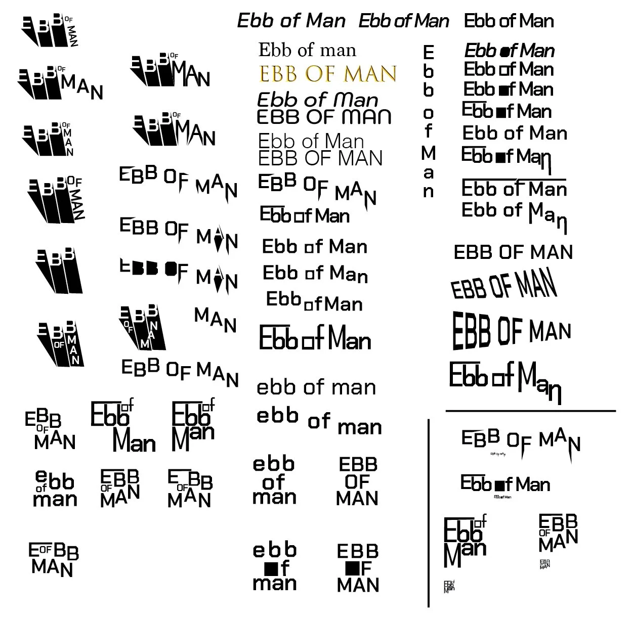
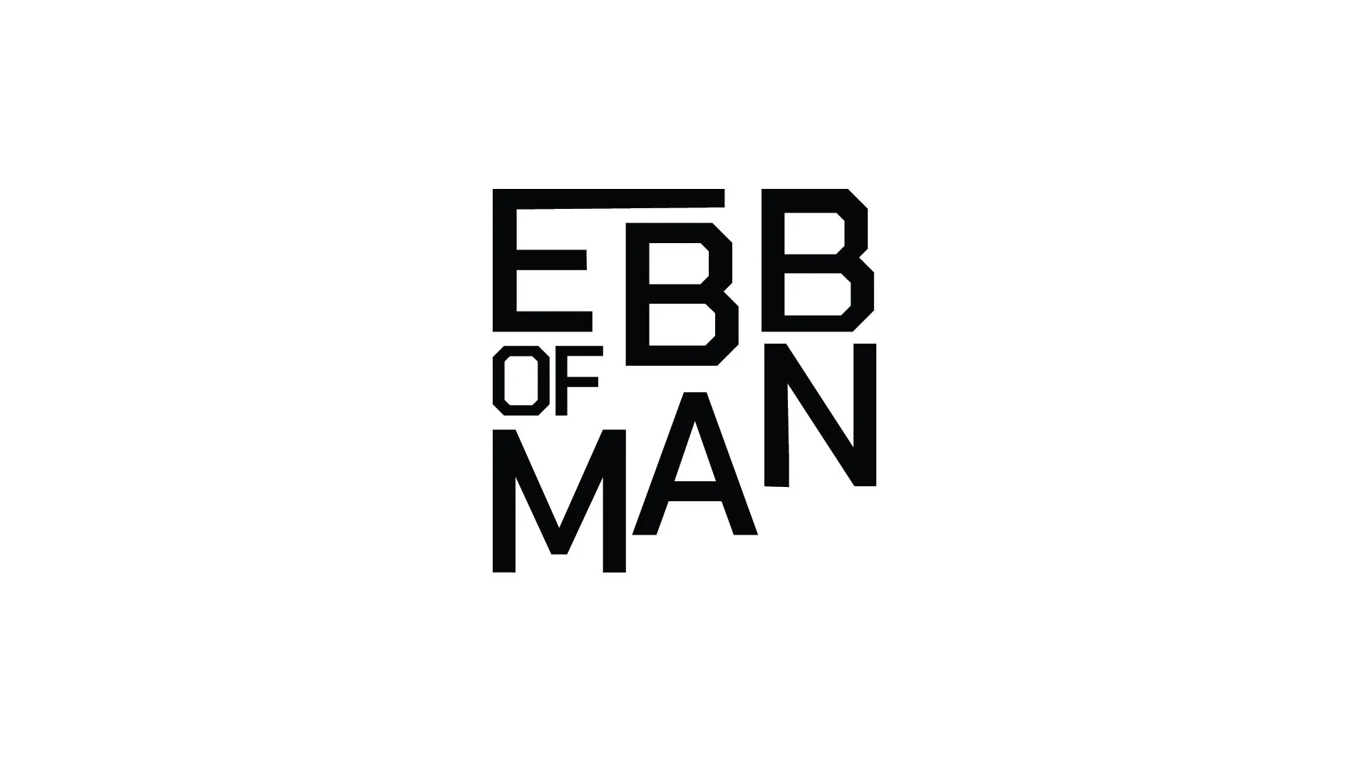
I focused on the word ebb for this project, knowing from early on that I wanted to have the wordmark move and look unstable in the final design. I used Illustrator to experiment and make countless sketches. Many of the tests have sharp, uneven, or unaligned elements. This was intentional as I wanted the whole feel to be unsettling to a point. Many of the early designs also have a square element. I experimented with this shape as well because in the story I had in mind, the ship would have been a cargo ship, and maybe something was wrong or was in one of the boxes that they didn’t know was there.
My professor was adamant we had as many variations as possible. This led me to continue to change and push what I could do. In the end, I picked a few of my favorites but decided on the final design as it didn’t need knowledge of the show to be understood, and I found the overall shape and legibility of the wordmark to be the most effective.
Mockups
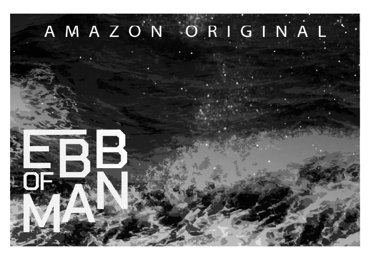
In the end, I also made thumbnails of what this show may look like. I mixed the sea with the stars to create a stylized effect and connect the two ideas further. I also inverted the colors, and I’m happy with the results.
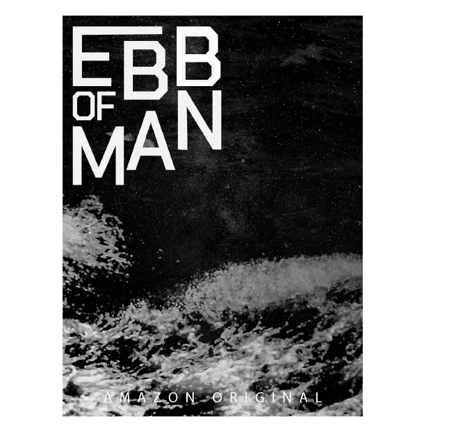
In these final compositions, the only thing id go back on would be the “Amazon Original” on the vertical mockup. I was limited because Amazon needs that text to be centered at the bottom but I didn’t want to make the design suffer for it.