Fall Brawl Poster
Background
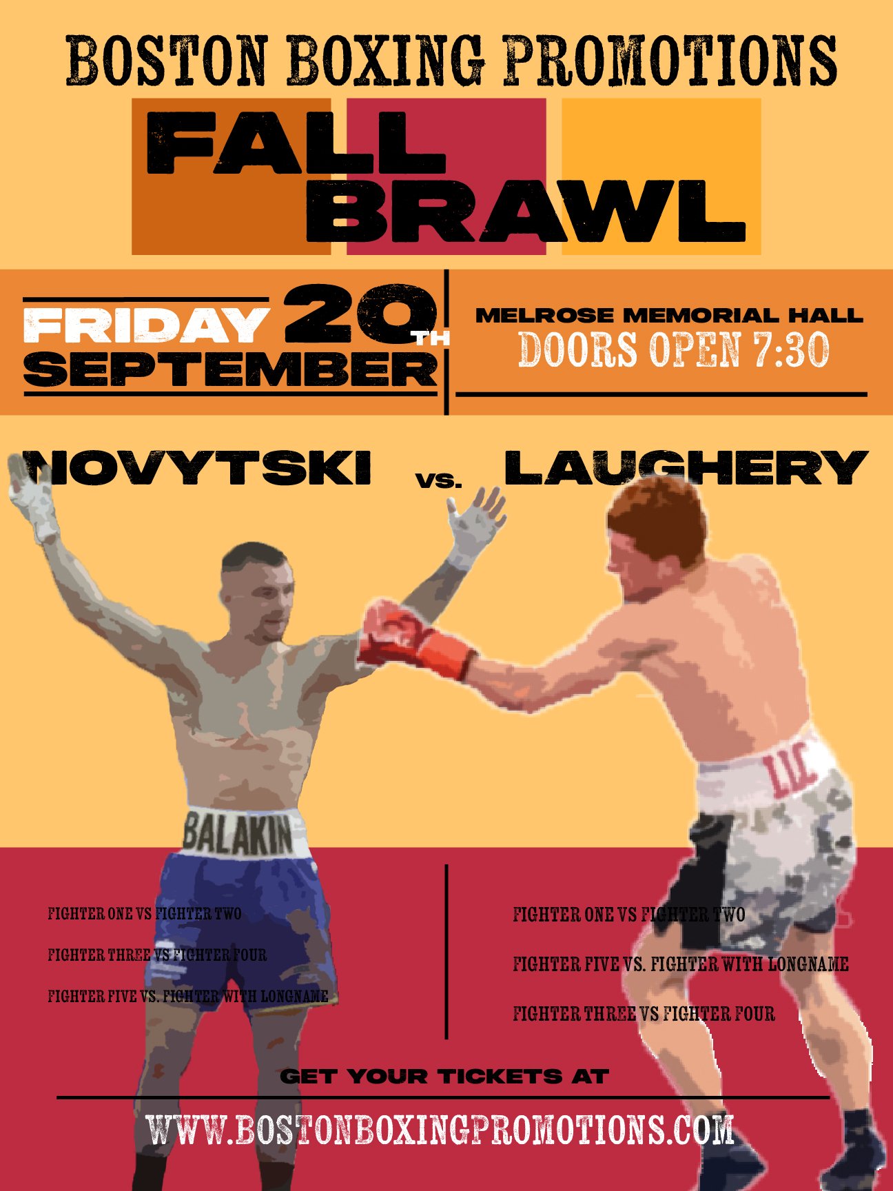
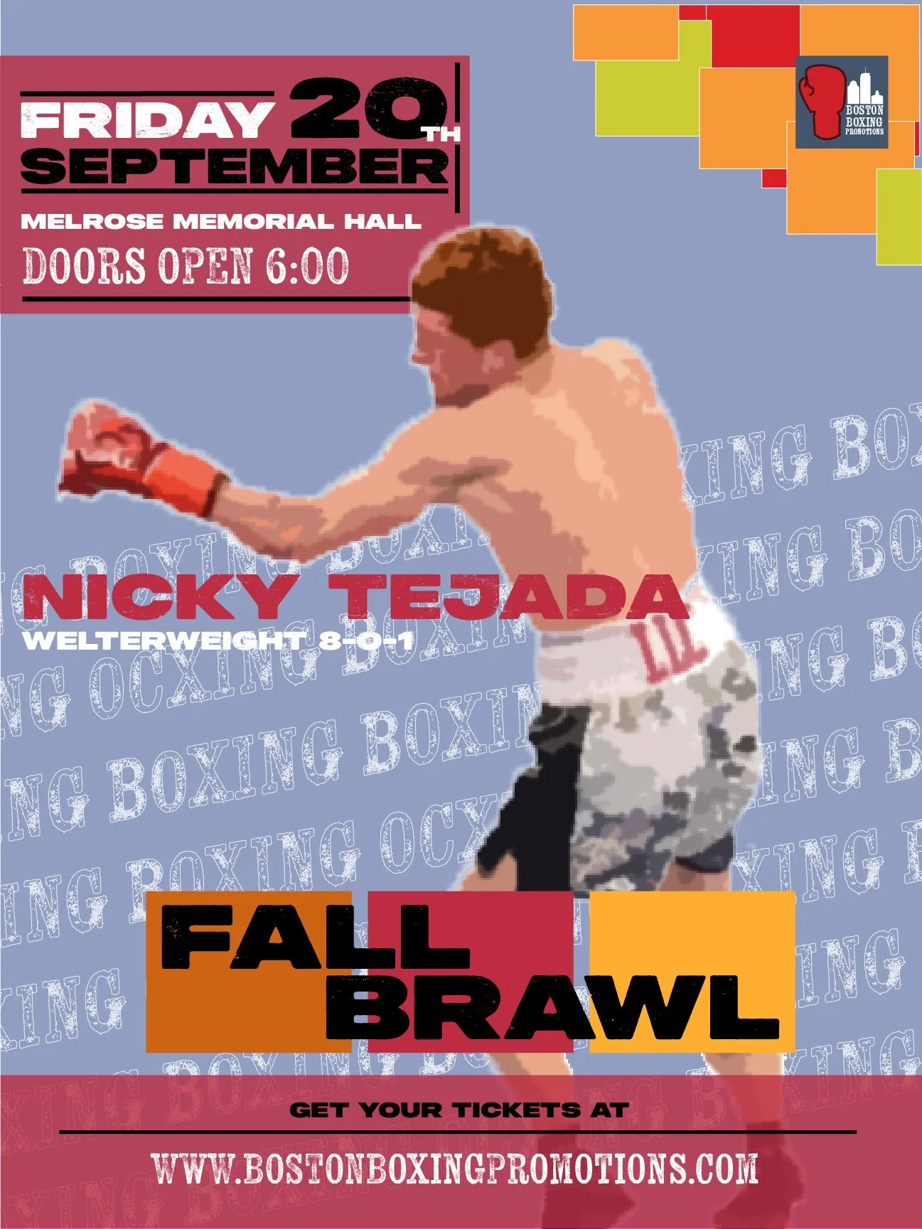
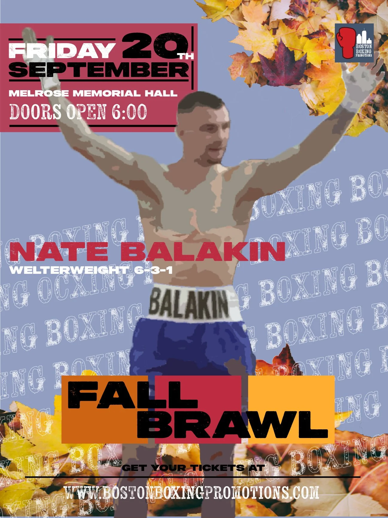
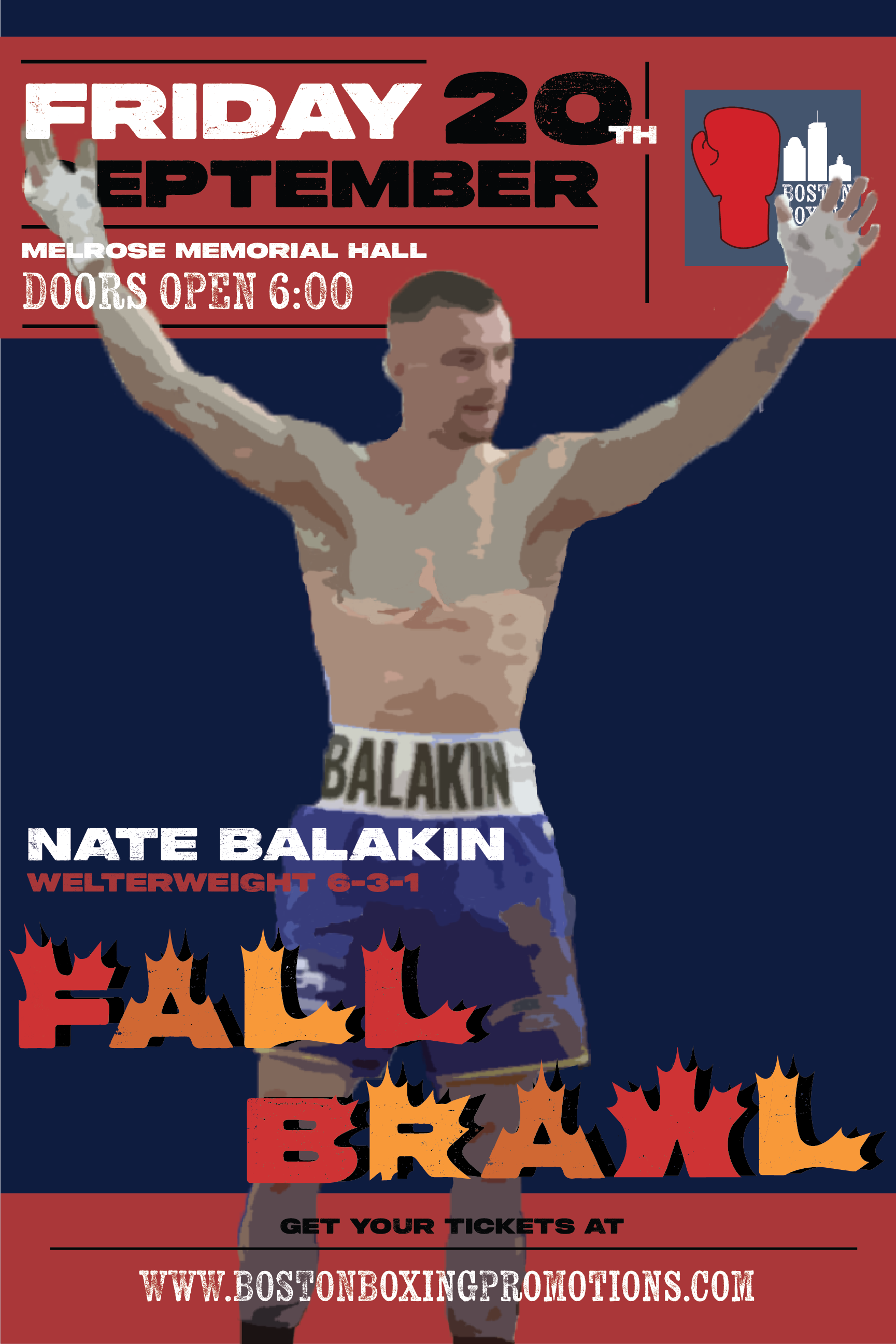
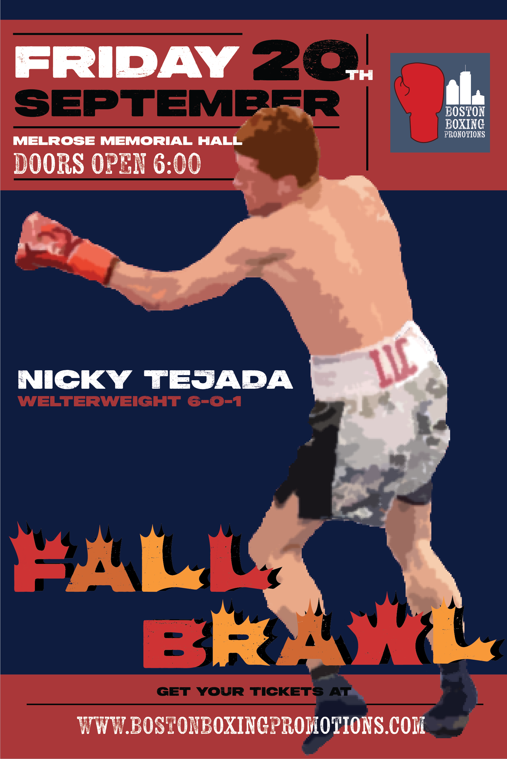
In this class, we had to pick an event to focus on. I picked the Fall Brawl by Boston Boxing Promotions. A local boxing event that was held at the end of September in Melrose, MA.
Avanced Typographic systems
2024
Process
I originally wanted to make the poster look retro and like those from the 50s and 60s. Over time they changed and became closer to the final products but keeping the “quirky” look. I think the most successful parts of the design are the colors and the “Fall Brawl” logo while the least successful would be the type hierarchy. I took a long time on these too changing colors and finding different positions for the text but in the end, I was never truly satisfied.
Unfinished/Unused
Early Designs and issues
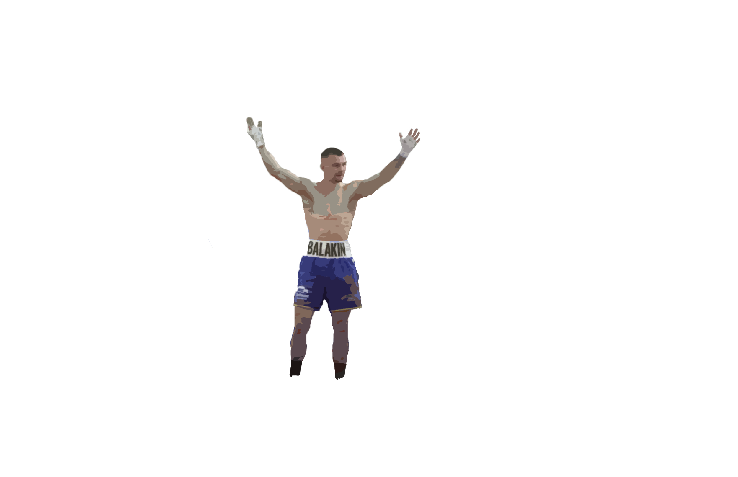
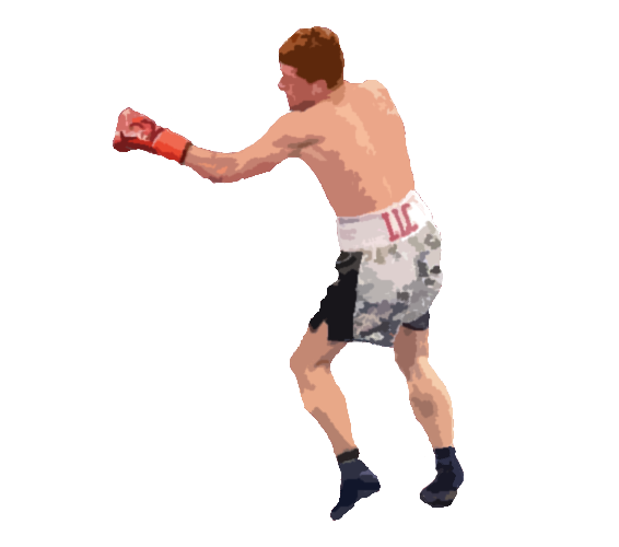
I quickly experimented with many colors and formats. I liked the old look but not having high-quality photos challenged me and kept me with the stylized illustrations I ended up using. I’m not too happy with these illustrations going back I would have changed the photos I used. I would also have scraped the retro poster idea, I could have gone in that direction in the beginning but not committed to it leading to the poster losing a bit of its identity.
The biggest issue I had for the whole class was committing to this event. Many of my classmates picked large plays or dance shows in Boston or New York. This led to them having numerous high-quality images and countless facts to choose from. I on the other hand picked a small boxing promotion based in New England. many of the boxers didn’t have high-quality images or descriptions Bios, something that would come back to bite me as we started work on our booklet. I did what I could but If I were to go back maybe I’d choose something with more resources to go off from.