

Background
Client: Apollo
5/3/25
This was a logo I created for a group I work with based out of New Bedford. This group ranges from film makers to music producers and for this project they asked if I could make them a logo, requesting for is to have a rough, CRT, and glowing look.

Process
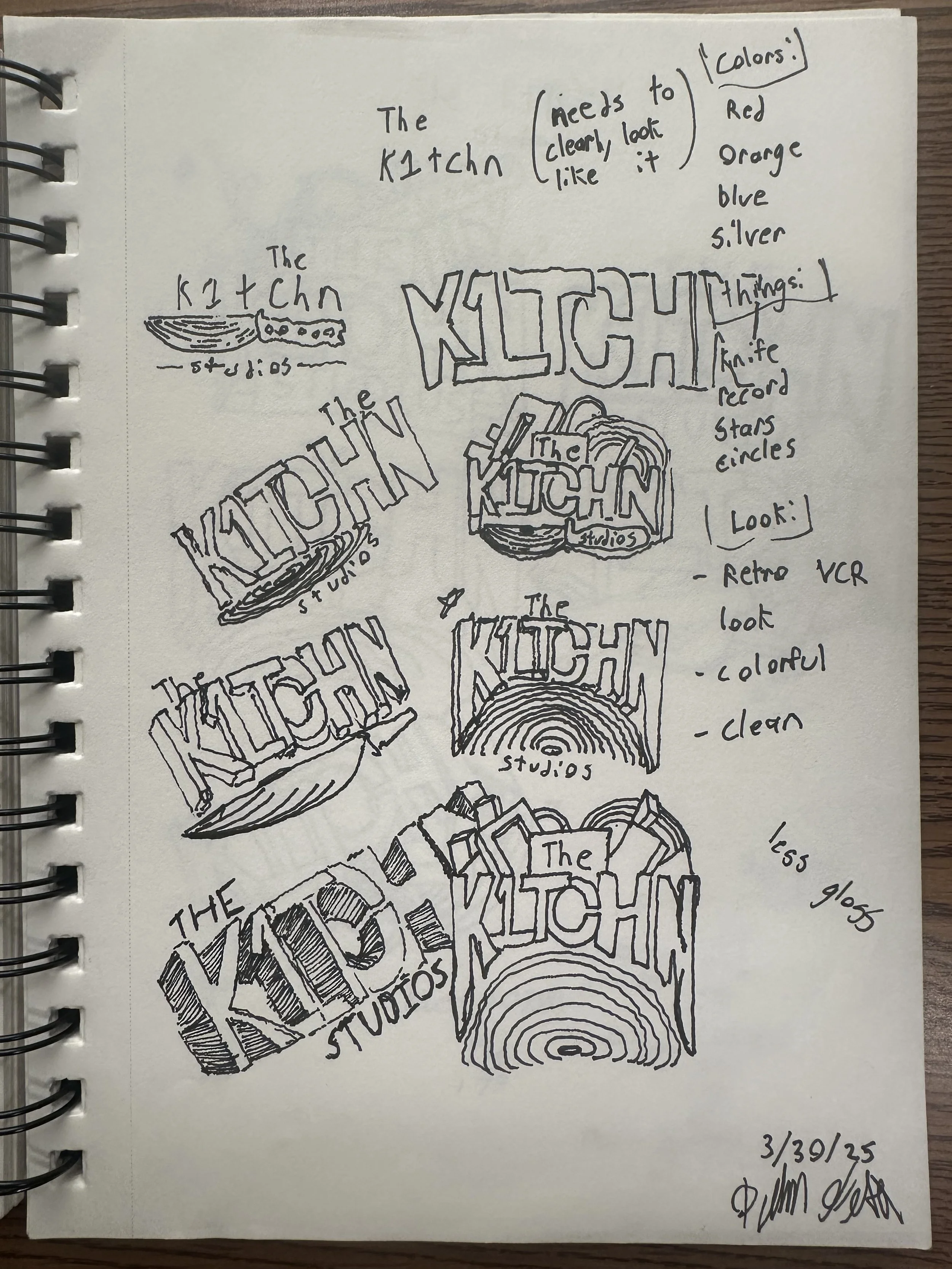
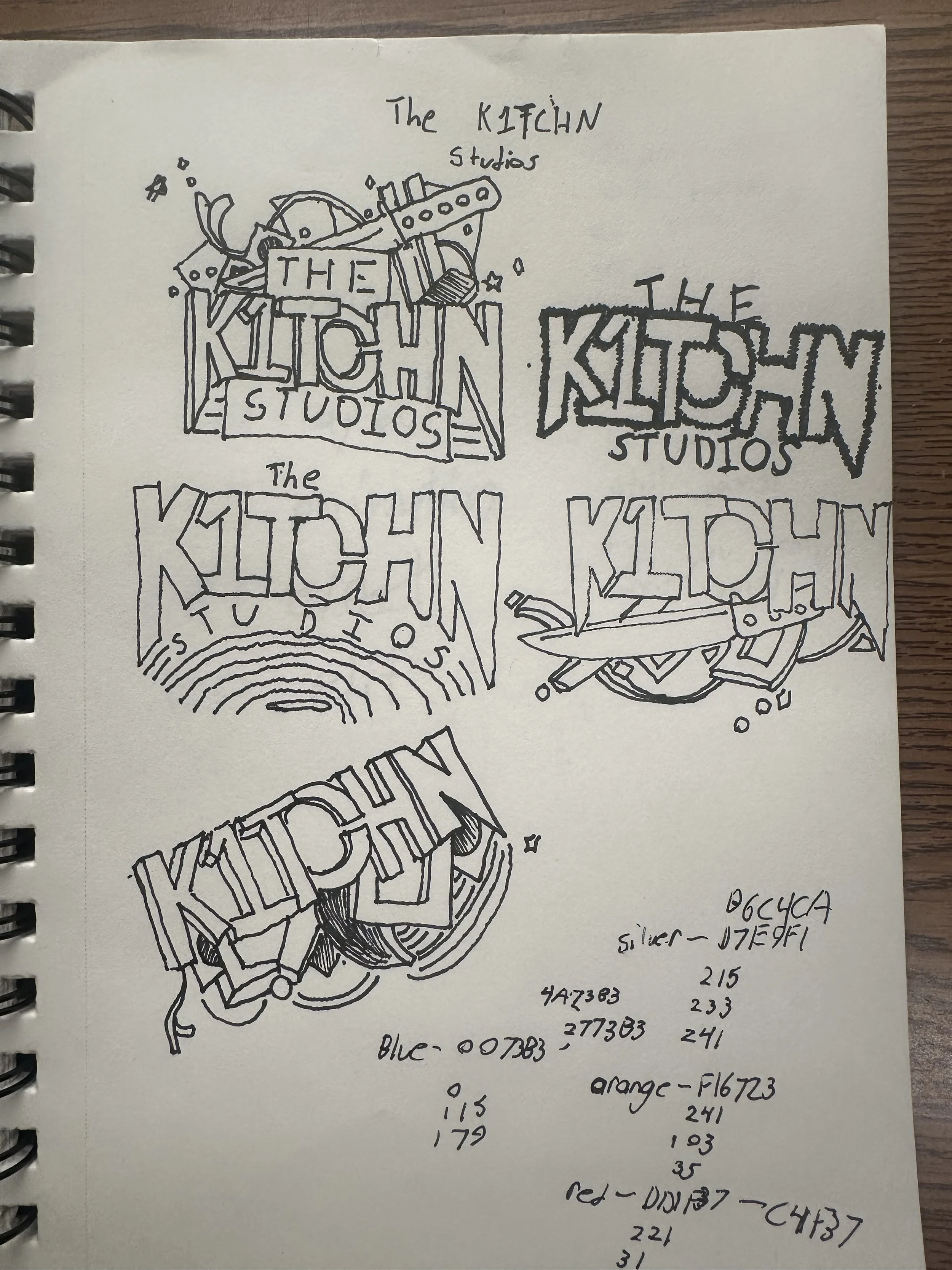
Originally they used an AI generated logo with bold stylized letters and abstract shapes (similar to some of my illustrations on the left) Though I didn’t mind the colors and form of the logo it obviously looked AI and needed a makeover so first I went to the drawing board and sketched out many options for new looks, some similar to the old logo some varying greatly.
After my sketches were done I met with the team. We picked the final together and they gave me valuable input on composition and look. We also discussed what they wanted the animation to be, setting up what I would work on when taking my designs digital.
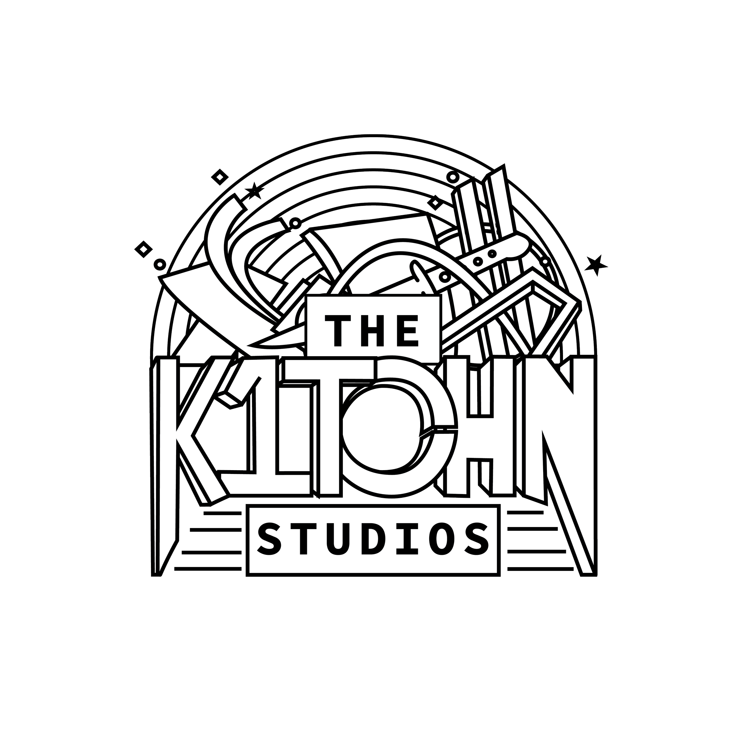
I started with the font, creating this bold, clean text which overlapped slightly. Later this would become an issue when layering effects, but I’m getting ahead of myself. After making the text I added the abstract shapes as well as the record in the background which was a recommendation from the team. I used the pen tool for most the design and it was pretty straight forward once I knew what I was looking for in the end. This straight-forwardness would unfortunately not continue as I moved to After Effects.
On To Illustrator

Early After Effects
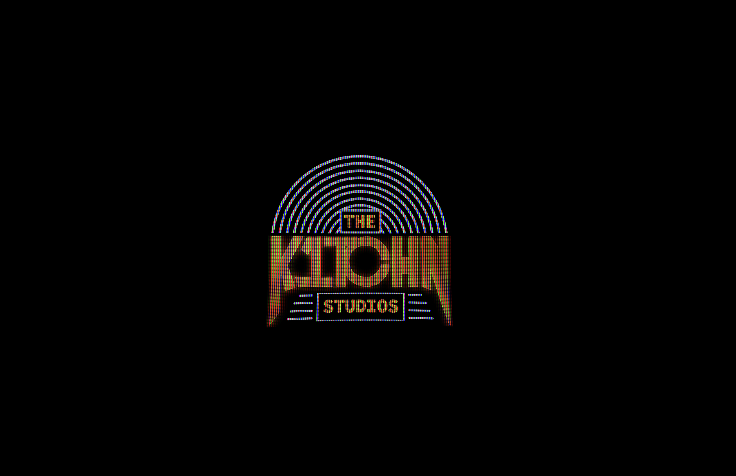
When I tell you I could write a short novel about the issues I faced and lessons I learned when working on this project Im not joking. There is a reason this project took me over a month to complete (that and the fact I was pushing this out during finals time). The team really wanted it to have that “VHS or CTR” so my first step was research.
I looked into countless plug-ins and You Tube videos to discover new ways to work, and get more of an idea how it may come out. First I downloaded what soon became my favorite tool, as well as my biggest issue I’ve faced in After Effects, The Saber plug-in. This is a great tool and something that allows for tons of customization when making effects like fire, lightning, and plasma, it also helped me in how I used it which was to create the glow and flicker effects on the “K1TCHN”.
CRT On After Effects
After settling on the effects and layout of the final (Seen on the right after Saber effects were applied) It was time to move onto the CRT aspect of the project. Seeing many designers recommended using a grid method using repeating RGB tiles I made my own overlaying it onto the exported footage of the design it gave the whole design a choppy and line-covered look. Messing around with these further and getting more recommendations from the internet I duplicated the effect and singled out the red, green, and blue elements of the design. This was difficult to balance due to the layers of filters toning down the orange and making it much less vibrant than intended.
Overall I am happy with the final outcome, though I wish I could have spent more time perfecting the form and look of the logo over problem solving the filters and getting it to even work at all. If I were to do it again, or go back and revise it I’d say I would brighten the colors, add more blue to the record behind the words, and mess with the kerning on the text a little more.
Problems, and Solutions
I originally wrote this section in the form of bullets, with each problem and the solution listed below. As I got to bullet 16 I realized it was pointless naming them all so I’ll leave you with this.
I once spent a week of work time, (which for me is about 10-15 hours on a personal project) trying to solve one opacity issue. I worked with peers, searched all ends of the internet, and got a professor for advice but to no avail. After stressing about this and about ready to restart all together I found the issue was one click away. Hidden behind about six drop-downs was one button that made my effect transparent fixing my issue. I don’t think there is a moral to this story just that its ok and expected to run into problems, its part of the process and should be seen as a challenge not the end of the world.
Sketches and AI original
