This was my final for Dynamic Screen-Based Typography. We were allowed to create whatever we wanted to. I choose to combine my loves for video, clothing design, conservation, and fishing, when making my brand New England Fishing.
Background
DYNAMIC SCREEN-BASED TYPOGRAPHY
12/10/24
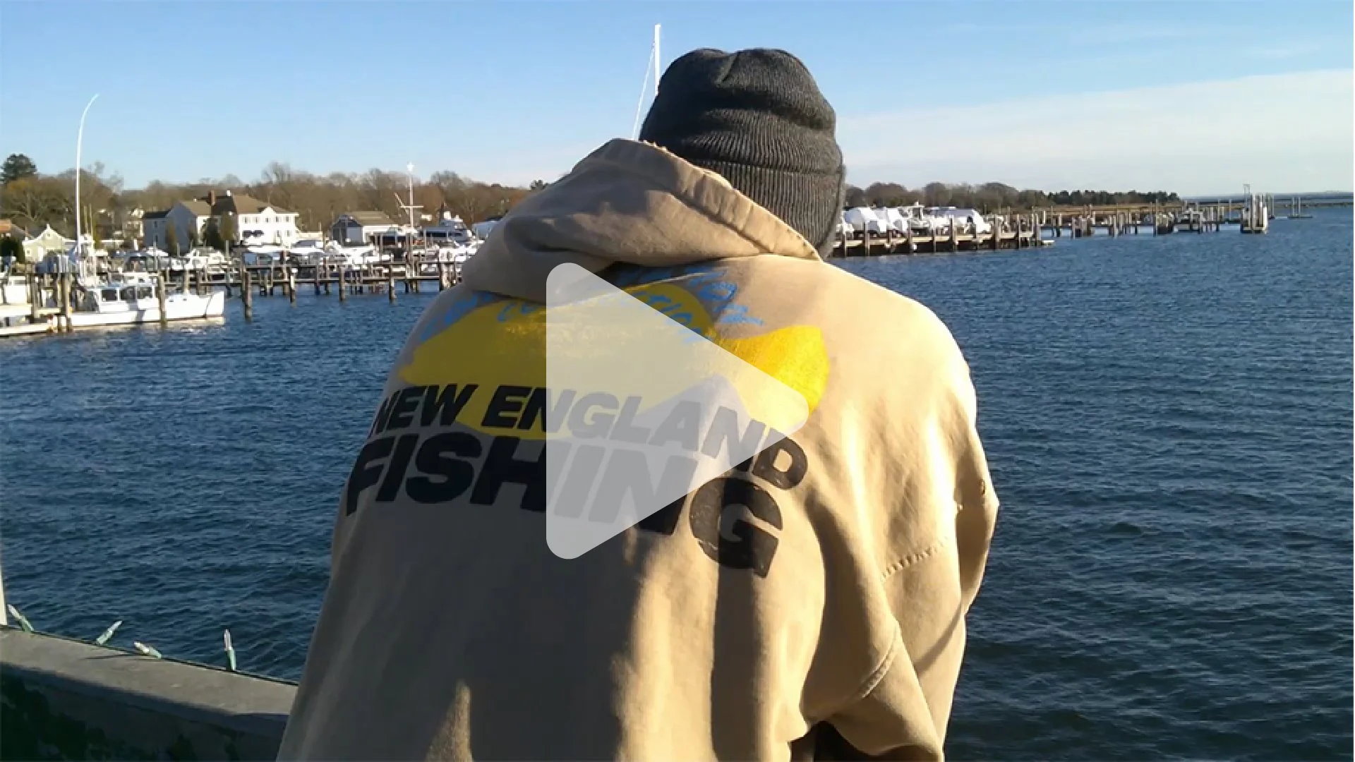
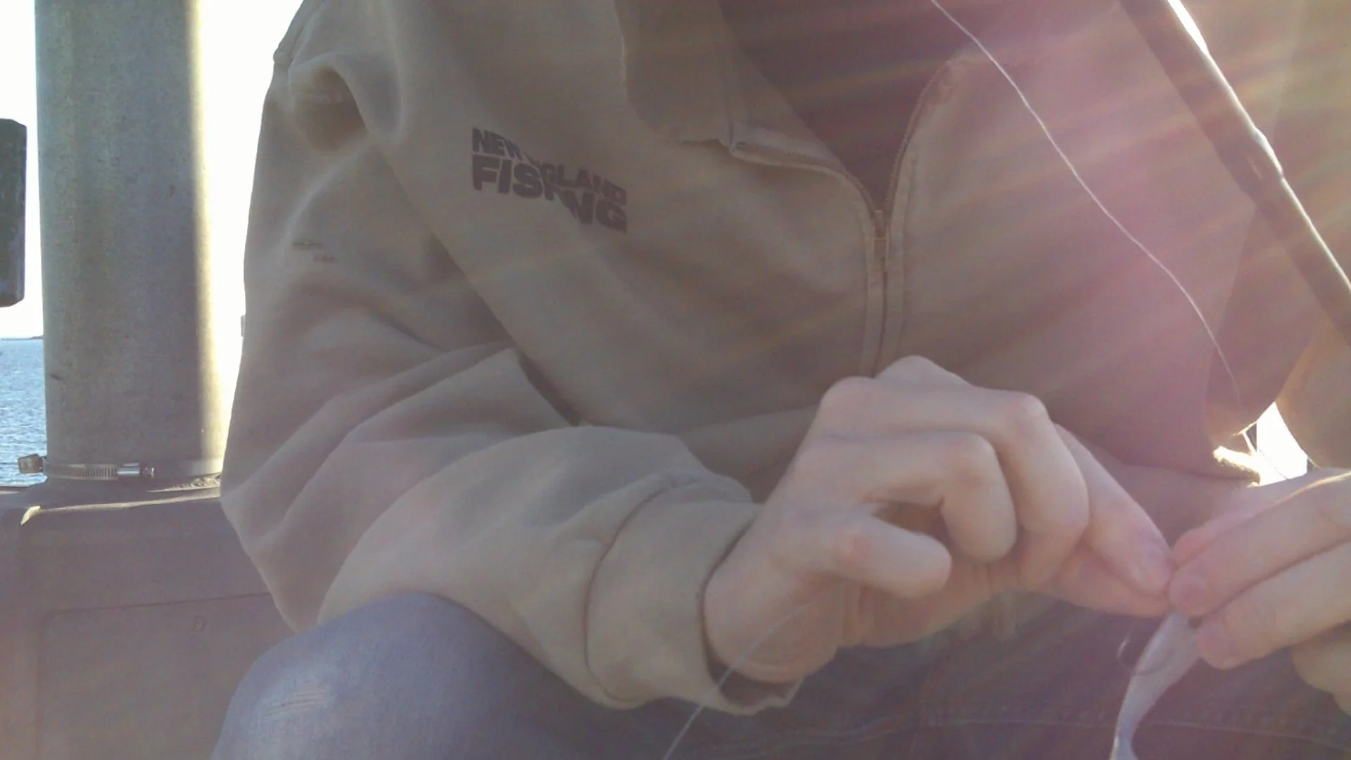
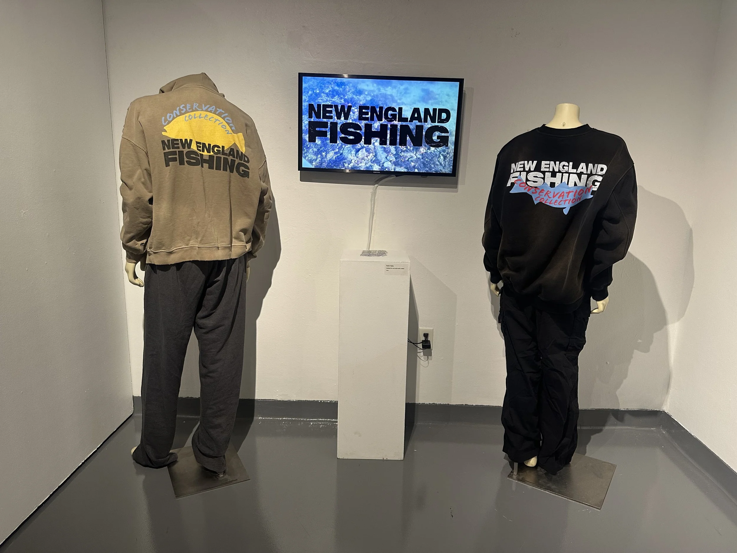
This was and still is the most comprehensive project I have ever worked on. The final video was shot with two friends at my favorite fishing spot in North Dartmouth. It was a passion project that I put countless hours into that semester. From branding and logo making to clothing design, sticker design, motion graphics, and videography, it had it all. In the end, I had stickers and the designs displayed in the gallery, along with the video set on a TV.
The Video
See the full video on Youtube
The Video Was shot on a cold November afternoon. It is made in the form of an advertisement, but also attempts to give information on fishing and the impact you can have on protecting the oceans. My biggest challenge with the video was finding good lighting away from the harsh glare of sunset. I also had to address avoiding the rough winds and chills that are bad that time of year. In the end, I am happy with the video and its rough, low-budget look. Enjoying fishing and being out with friends made it feel natural as a group just going out and recording their time.


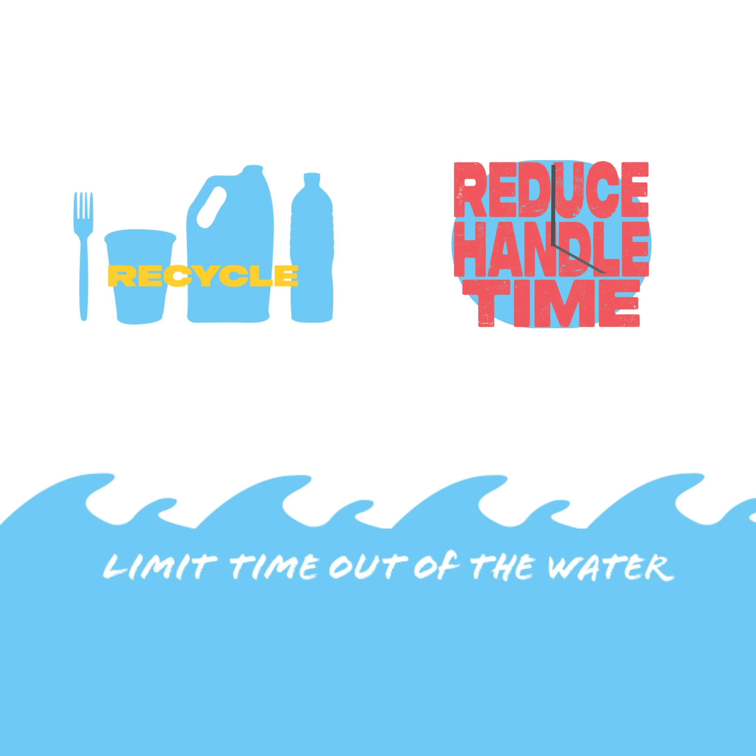
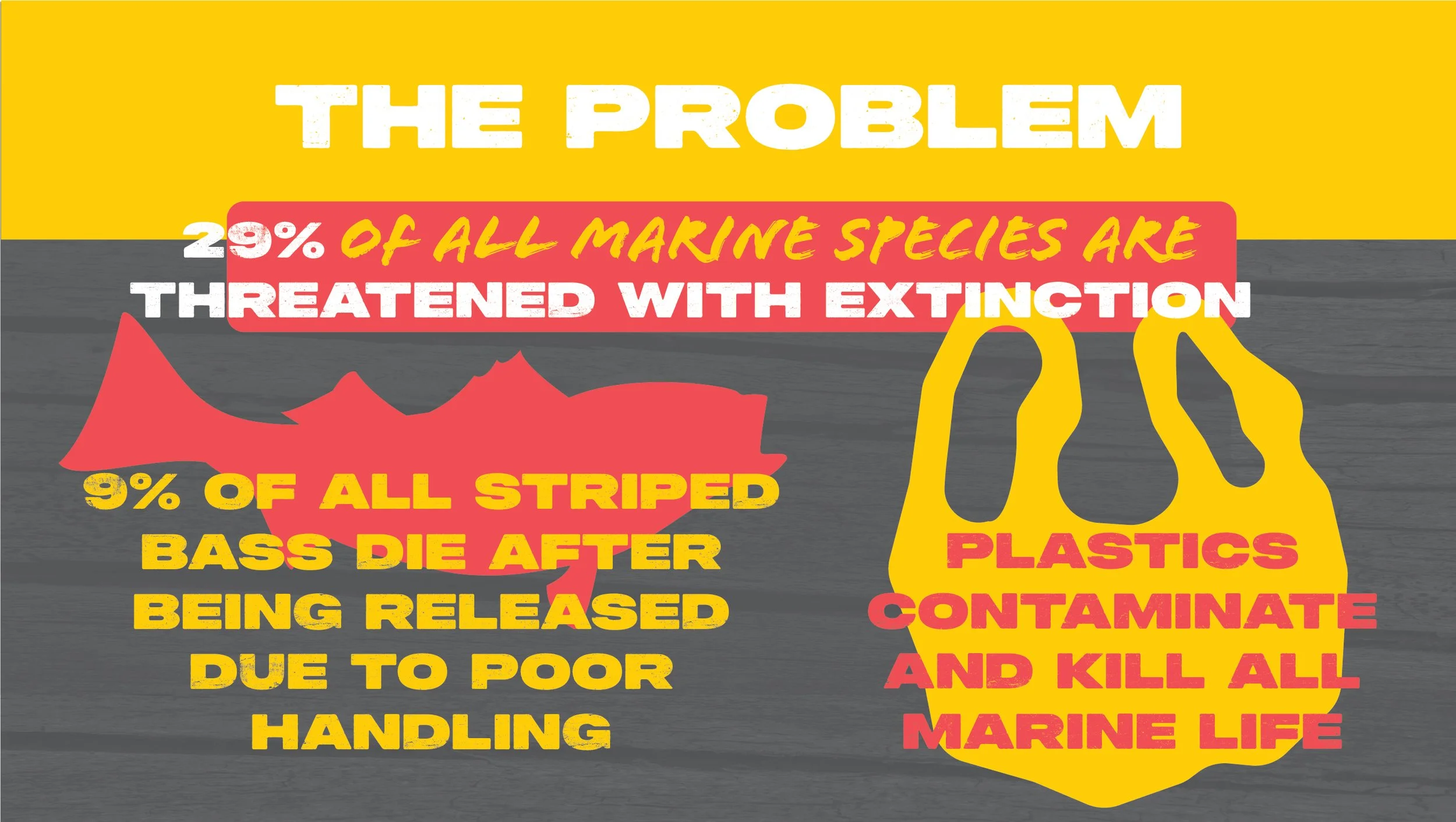
After developing the three versions of the logo mark, it was time to start putting them to use. I tried to see how they would look over different colors, tweaking the shades as needed. At about this time, I also started what would become the motion graphics. Laying out the illustrations and moving them around to see what would work, I came up with three "Slides” that showed the facts and issues within conservation.
These slides are some of my favorite and least favorite parts of the project. I am happy with the simplicity and effectiveness of some of the animation but I feel if I had changed the color to make them darker, it would have come out better. I also ran into issues with the light colors not being legible alongside each other. This made me have to go back many times and rethink my game plan altogether.
Asset Developments
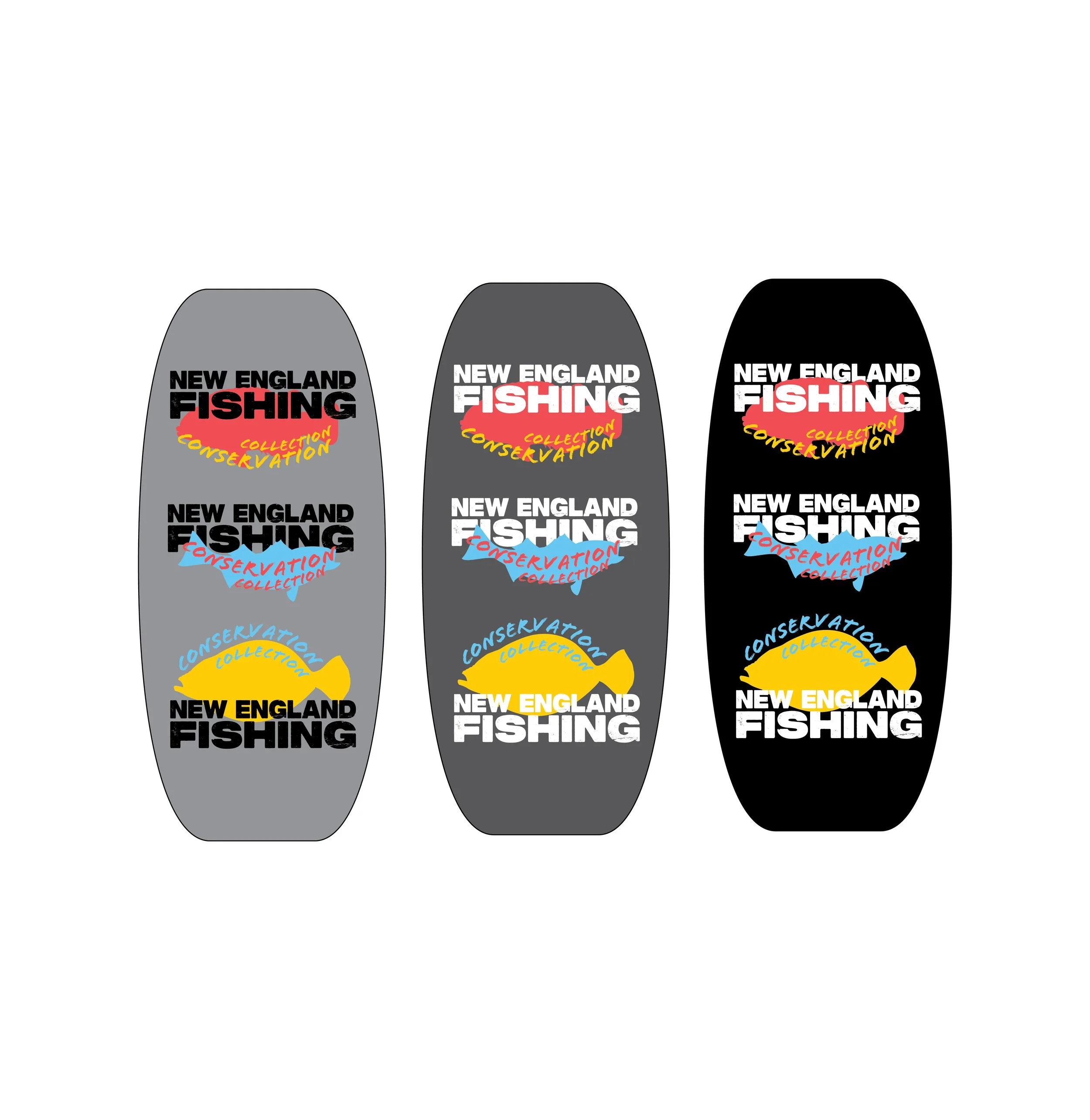
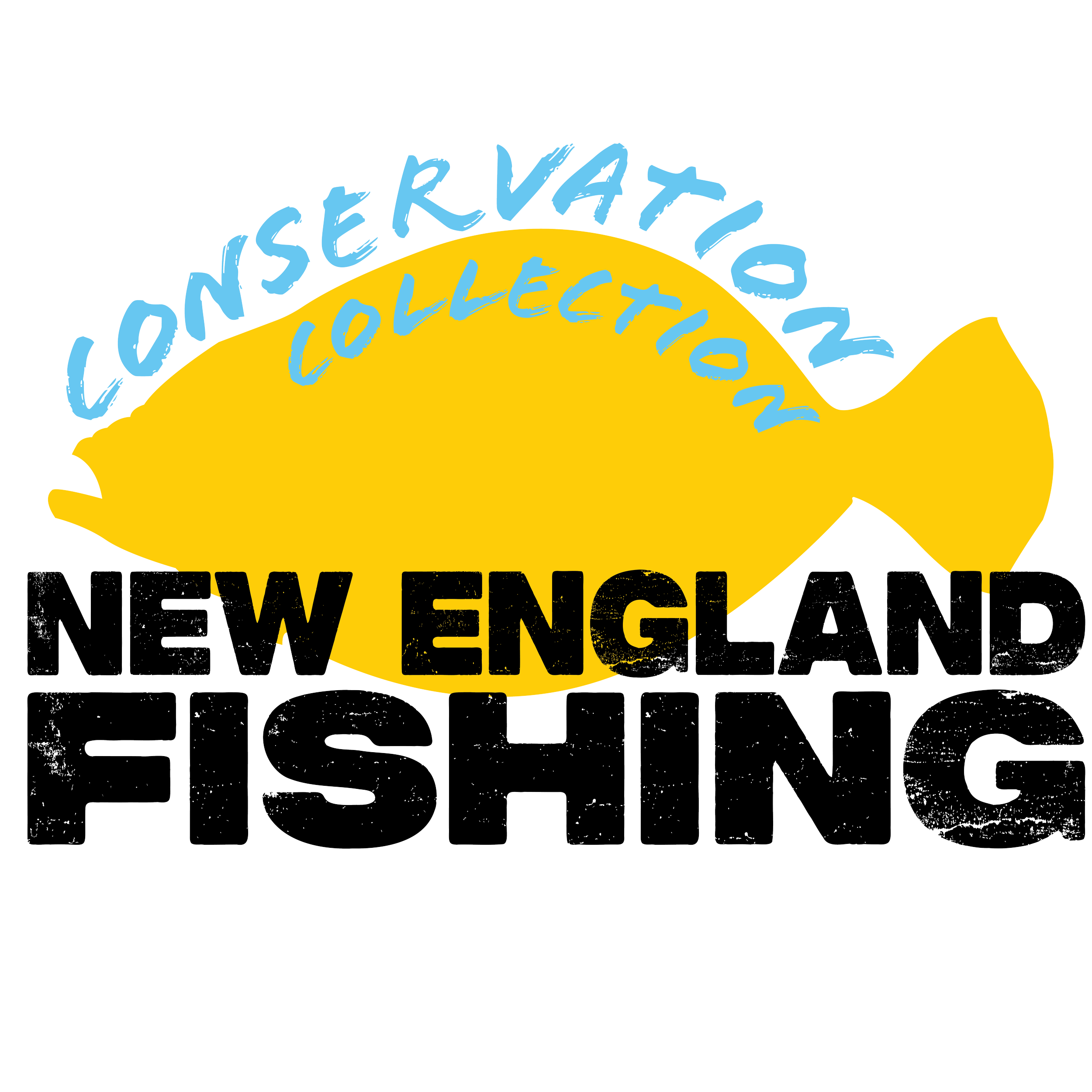
I had the idea of making a fishing brand for a while before this class. But I had no idea in what direction I wanted to go. When I have complete creative freedom for a whole project, I want to make something I care about. So, I took the idea of a fishing brand and combined it with two other things I love: conservation and New England. At first, I wanted to make a more complex logo with an illustration and fish in the shape of new england, but looking at other brands and developing my idea of the video, I wanted to create a more recognizable mark.
I chose to have three variations of the logo. The main logomark with a silhouette of a striped bass (seen to the left) a yellow version featuring a summer flounder, as well as a red version featuring a toutog. This third version I made along with the rest, but it never got printed or used.
Early Process

Printing and Display
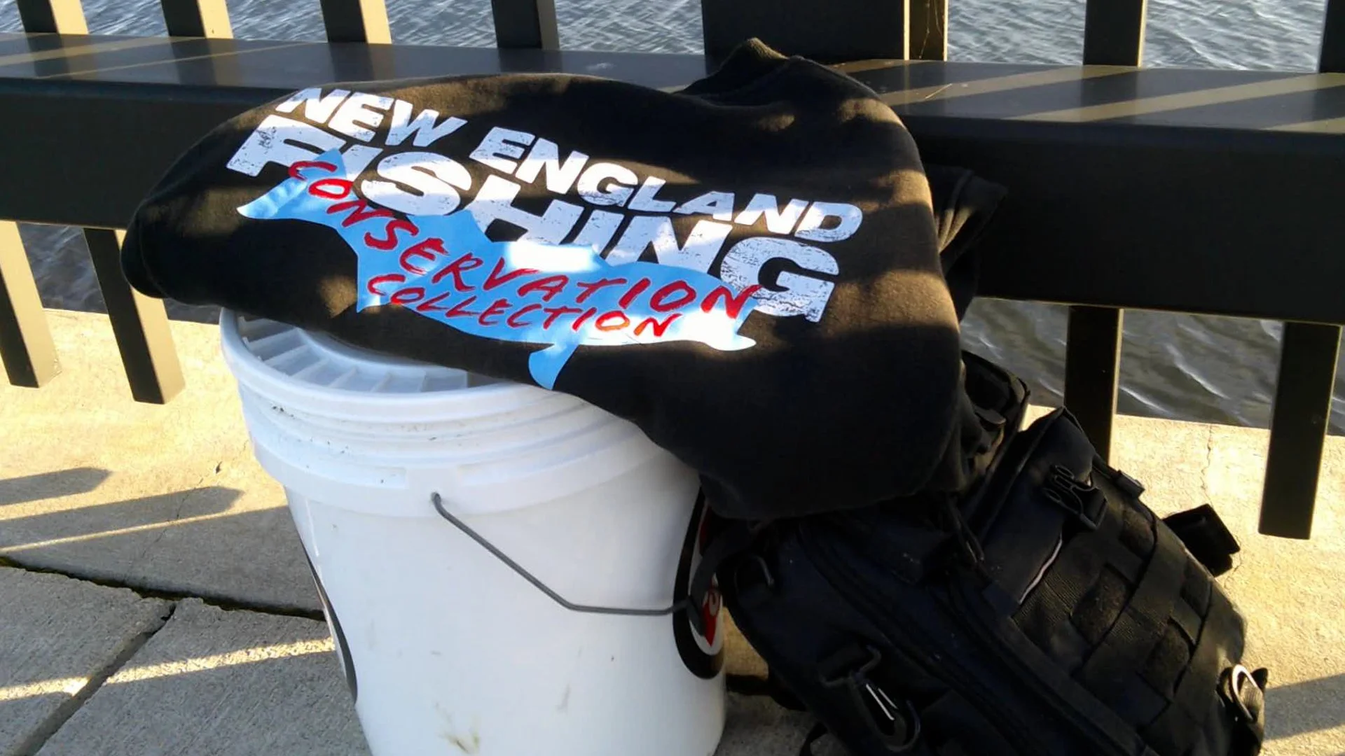
In the end, I had two designs printed, as well as 50 stickers to hand out. I didn’t have time to print the clothing at school, so I used a website called Tapstitch that allowed for high quality and lots of customization. I ordered the “weathered” versions of each design that here sun-stained or had small cuts in the cloth. This added to the athstetic and made it look like they had been out in the summer sun for a long time as well as, the cuts mimicked real marks on many of my shirts where hooks and lures get stuck while fishing.
Much of the information in the video I decided to animate. For each portion of the video that had the info pop-ups, I animated two simple graphics. Creating the graphics was the easiest part. What was harder was finding the right size, color, and position of each graphic. One thing I never had to deal with before was thinking about how the color of an animation needs to work with not just one frame but the whole video as it changes; looking back, I would have put more thought into it or changed it. Darkening the color for accessibility and legibility would have done me good on some of my animations.
Overall, I am happy with how it came out. This was my first time working with video and animation together and I like many of the choices I made. I kept it pretty experimental, not limiting myself much in terms of color and theme.
Motion Graphics

Motion Graphic Slides

Different Uses of Text and Image


Unfinished/Unused